Nine brands, built from the mark to the hosting.
Each of these is a whole identity and a whole build. The palette, the photography direction, the type system, the site, and the infrastructure it runs on.
- Projects
- 09
- Categories
- 06
- Years
- 2019–2026
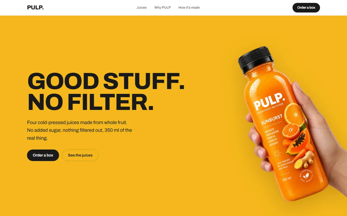
PULP
A juice brand with four flavours and no house colour. Each one takes the page over completely.
Food & drink2026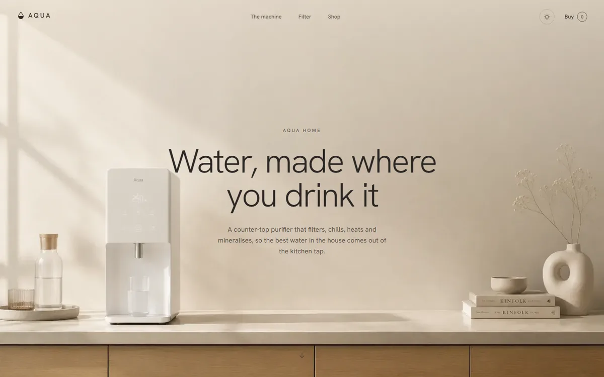
AQUA
A water product that refuses to look clinical: linen, sand and clay instead of the category's blue and chrome.
Home & appliance2026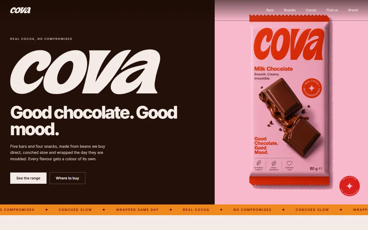
COVA
Four core browns plus a deep and soft pair per flavour, every hex sampled from the artwork rather than chosen beside it.
Food & drink2026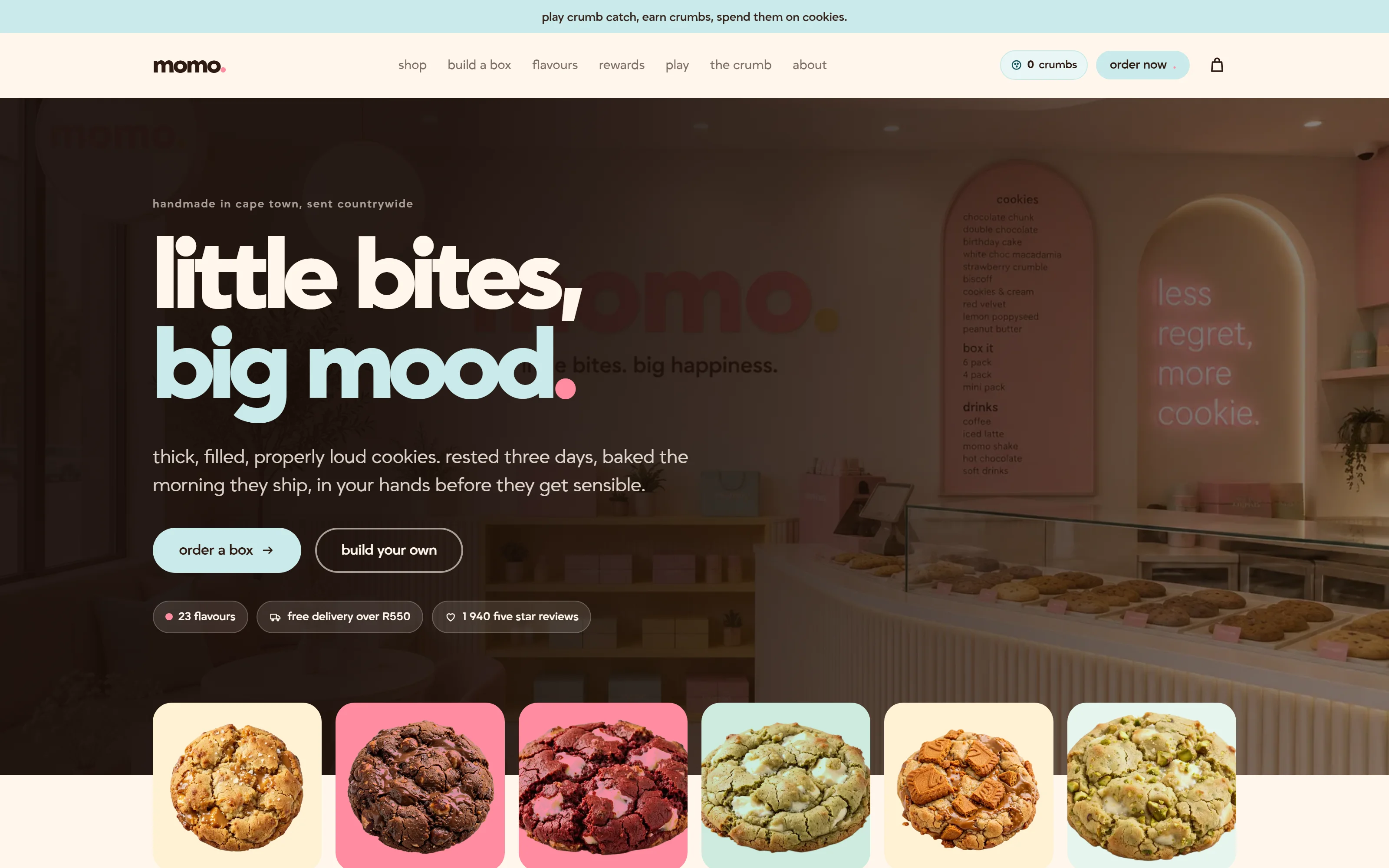
Momo
A Cape Town cookie bakery that ships nationwide. Twenty-three flavours, three colour themes, and a box you build yourself.
Food & drink2026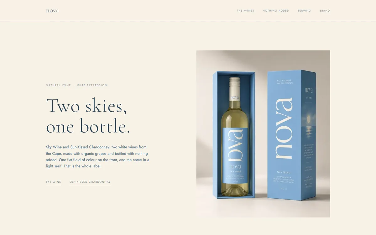
NOVA
A serif that says one word and a sans that says everything else. The whole identity is that one rule.
Wine & spirits2026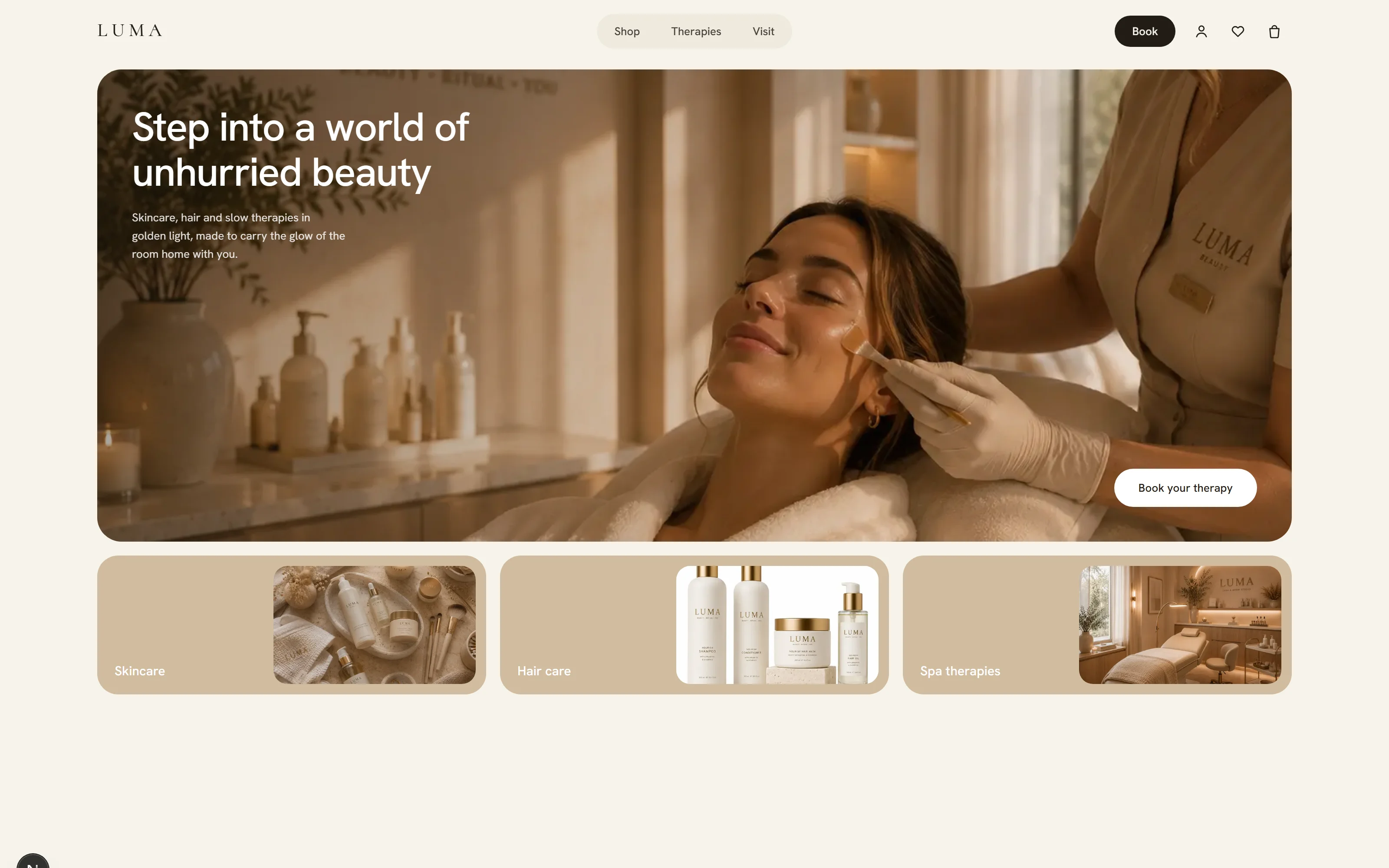
LUMA
Everything on the page is a rounded card on one ivory ground. The whole system is a single surface rule.
Beauty & wellness2026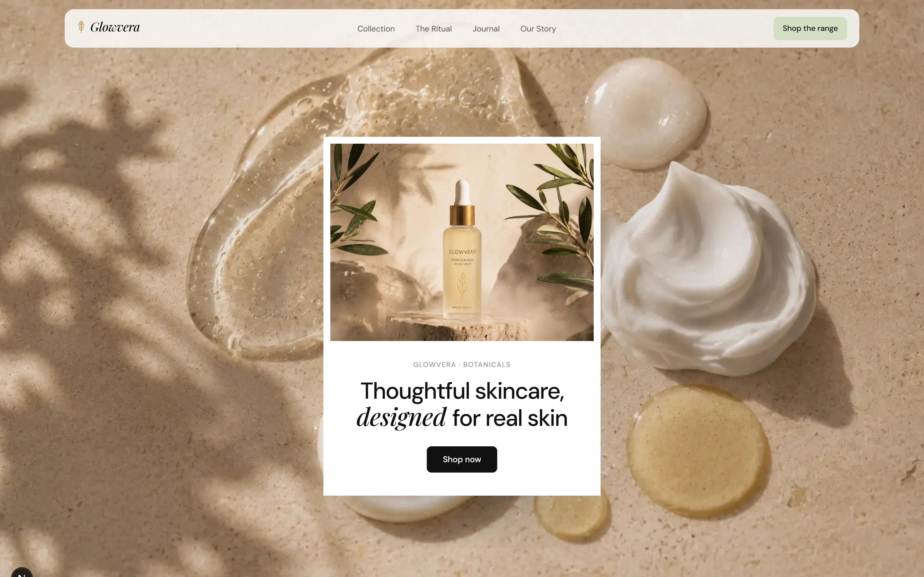
Glowvera
White, one sage accent, and a serif that is only ever allowed to say the product's name.
Beauty & wellness2026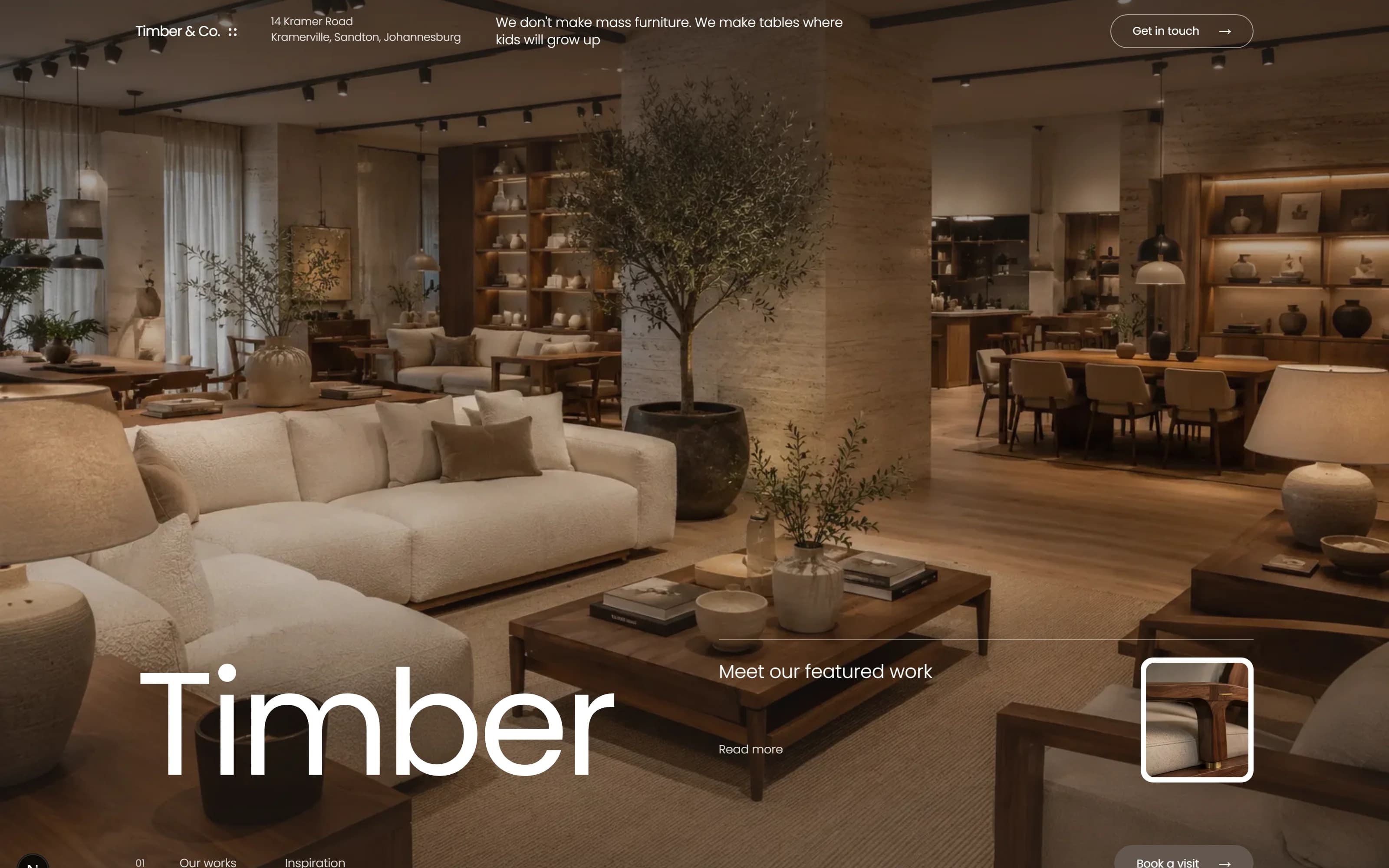
Timber & Co.
A furniture maker whose mark is a dovetail joint, and whose delivery estimator is the most-used page on the site.
Furniture & interiors2026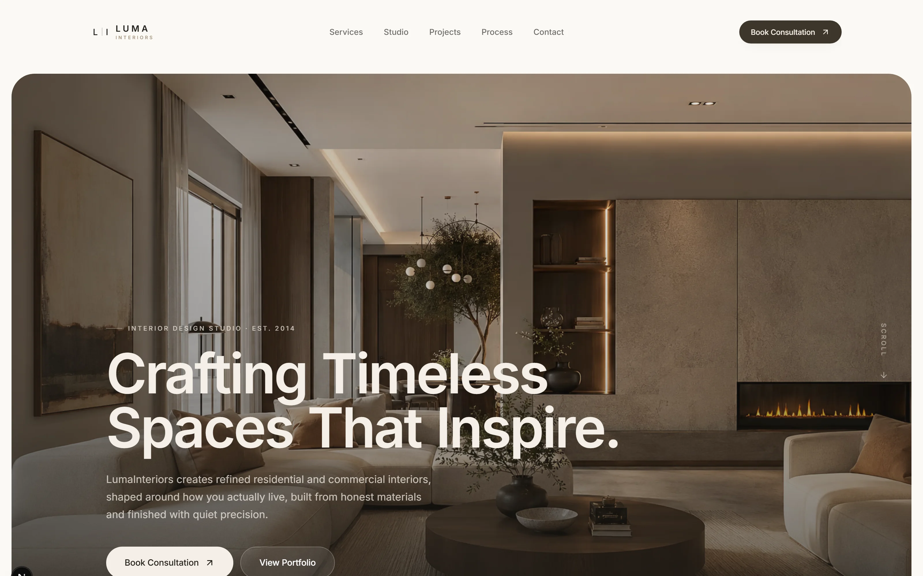
Luma Interiors
A Sandton interior studio whose site is set in the same palette as its rooms: ivory, sand, clay and espresso, and nothing brighter.
Interior design2026
The tools we build, host and support with
- Next.js
- React
- TypeScript
- Tailwind CSS
- Node.js
- React Native
- Supabase
- PostgreSQL
- Prisma
- Vercel
- AWS
- Microsoft Azure
- Cloudflare
- Docker
- Microsoft 365
- Google Workspace
- Entra ID
- Figma
- Adobe CC
- VS Code
- GitHub
- Resend
- Stripe
- Sentry
Every project on this page shares three decisions.
They are not house style. They are the three things that make a brand still look deliberate two years after we hand it over.
- 01
The palette is sampled, not chosen
Every hex comes off the product, the packaging or the photograph rather than from a picker beside it. Near is worse than wrong when the two are seen together.
- 02
One rule carries the identity
A serif that says one word. A single surface radius. Colour that is only ever a ground. One rule a client can actually follow without us in the room.
- 03
Contrast is measured, not eyeballed
Every pairing on every one of these sites was measured at the size it is actually set. Where the reference printed white on a colour and it failed, we departed from the reference.
Want yours on this page?
Tell us what the business does and who it sells to. A fixed quote comes back inside two days.
- Office
- Sunninghill, Sandton, 2196
- Hours
- Mon–Fri, 07:00–17:00
- info@bonangtech.com