Momo
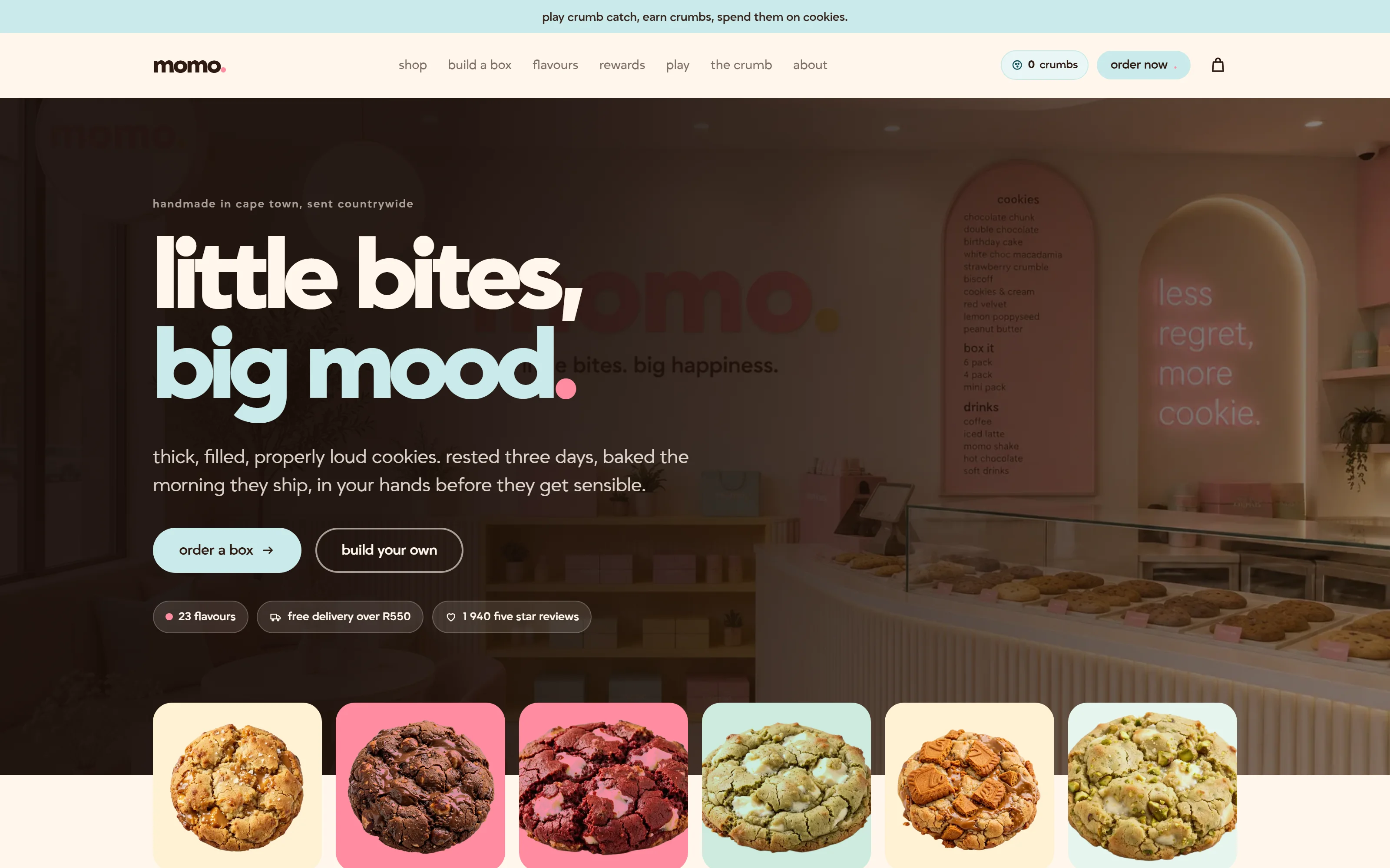
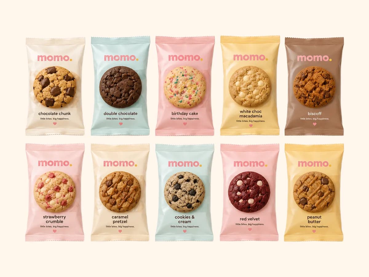
Twenty-three flavours is too many for a menu and exactly right for a box you fill yourself. So the site is built around the box rather than the list, and every flavour arrives in a wrapper printed on its own colour.
- Category
- Food & drink
- Year
- 2026
- Scope
- 5 workstreams
- Brand identity
- Packaging art direction
- Website
- Build-a-box order flow
- Theme system
- Next.js
- TypeScript
- CSS
- Vercel
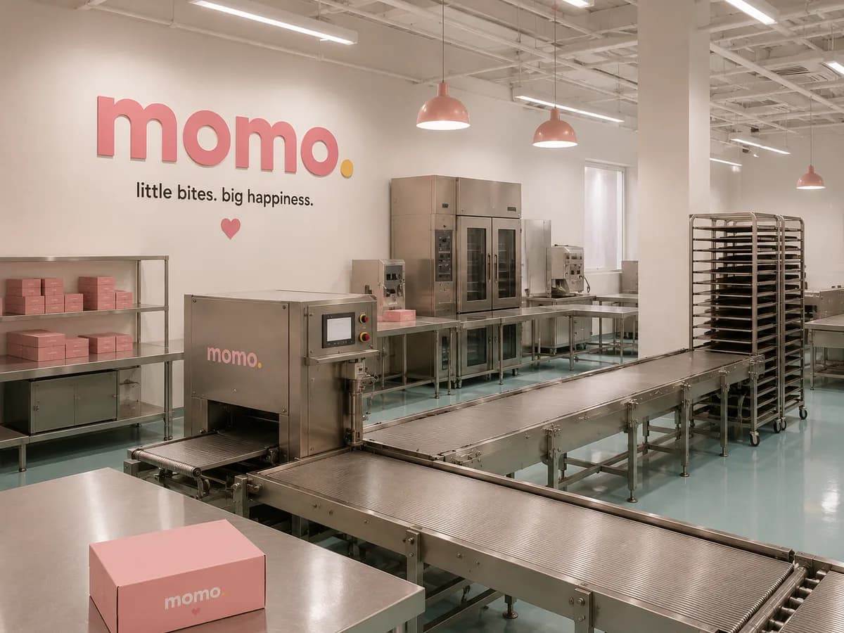
Momo bakes cookies in Cape Town the morning they ship and couriers them anywhere in the country. The range had grown to twenty-three flavours, the orders were arriving over WhatsApp, and the brand was a wordmark and a heart. What was needed was a shop that could take an order for a box of six without anyone typing it up, and an identity that could hold twenty-three products without turning into a rainbow.
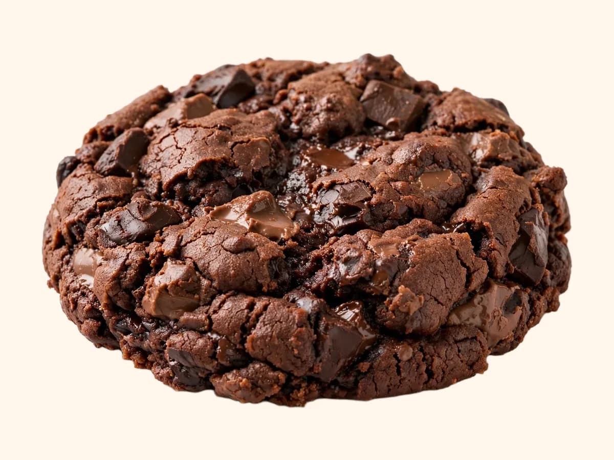
The answer to both was the wrapper. Each flavour sits on a pale field taken from its own colour, with the same wordmark, the same heart and the same line of type in the same place. Twenty-three of them side by side read as one range because everything except the colour is identical.
Four decisions the whole project rests on.
- 01
Build a box, not a cart
The main flow is a box of six, nine or twelve that fills as you pick flavours, with a counter that tells you how many spaces are left. A cart for single cookies exists, but it is the second door, not the first.
- 02
One pink, one yellow, one ink
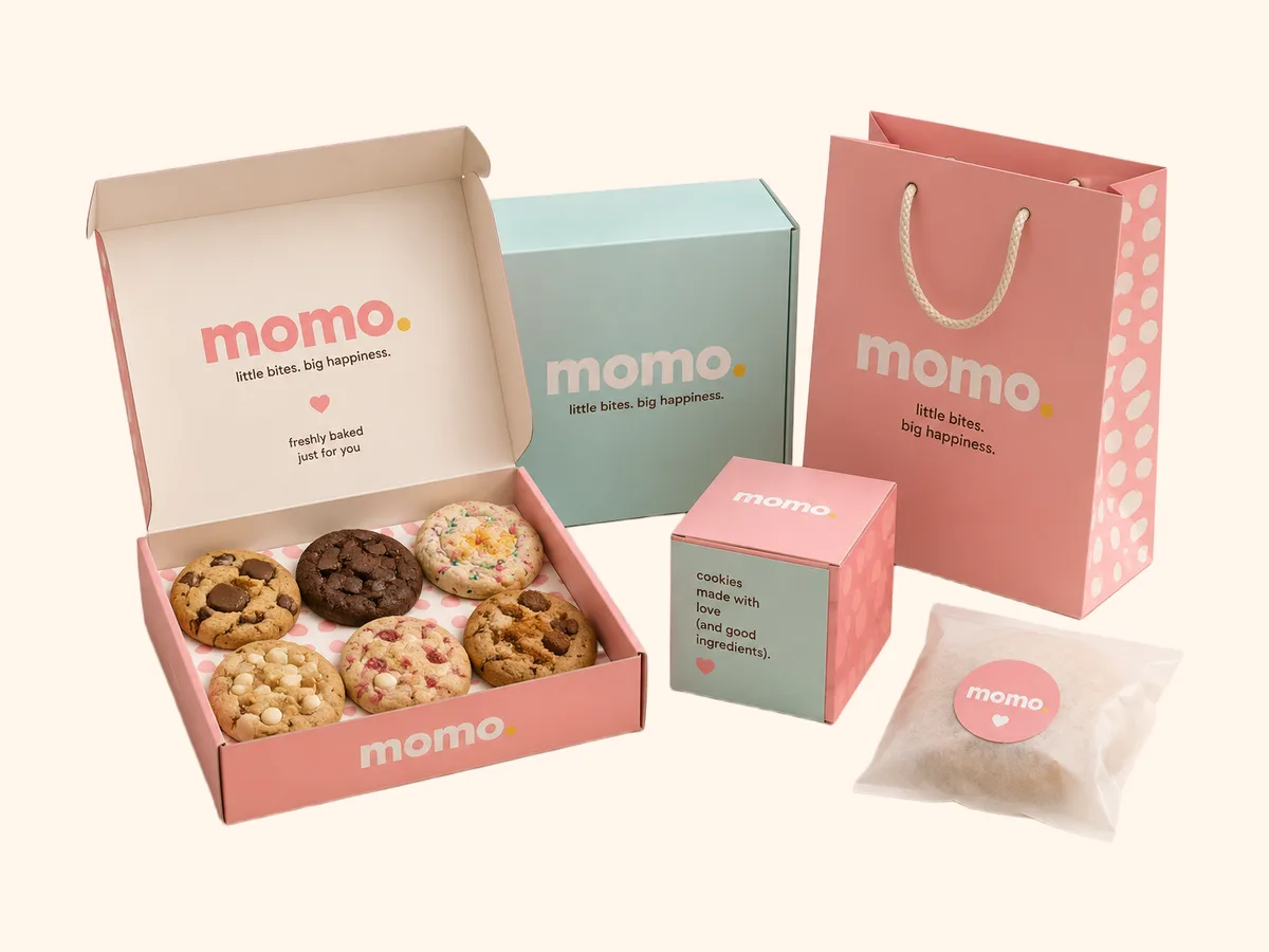
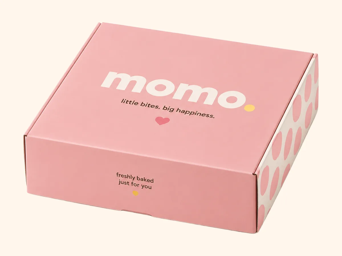
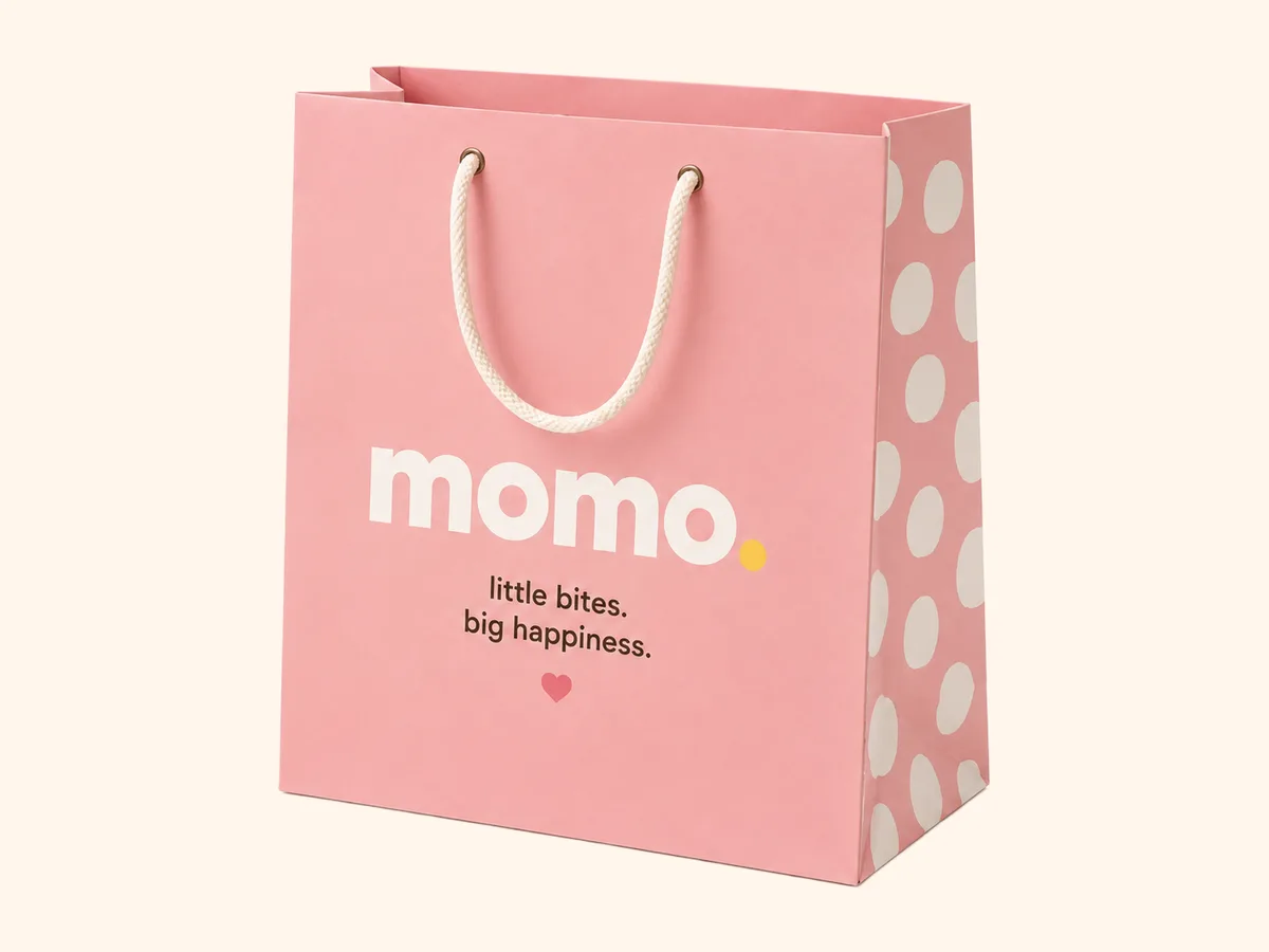
The hero, the buttons and the announcement bar use a single pink, one yellow for the full stop and the badges, and one near-black for everything that has to be read. The wrappers are the only place the palette widens, and there it is a pale tint, never a second voice.
- 03
Three themes, one keystroke
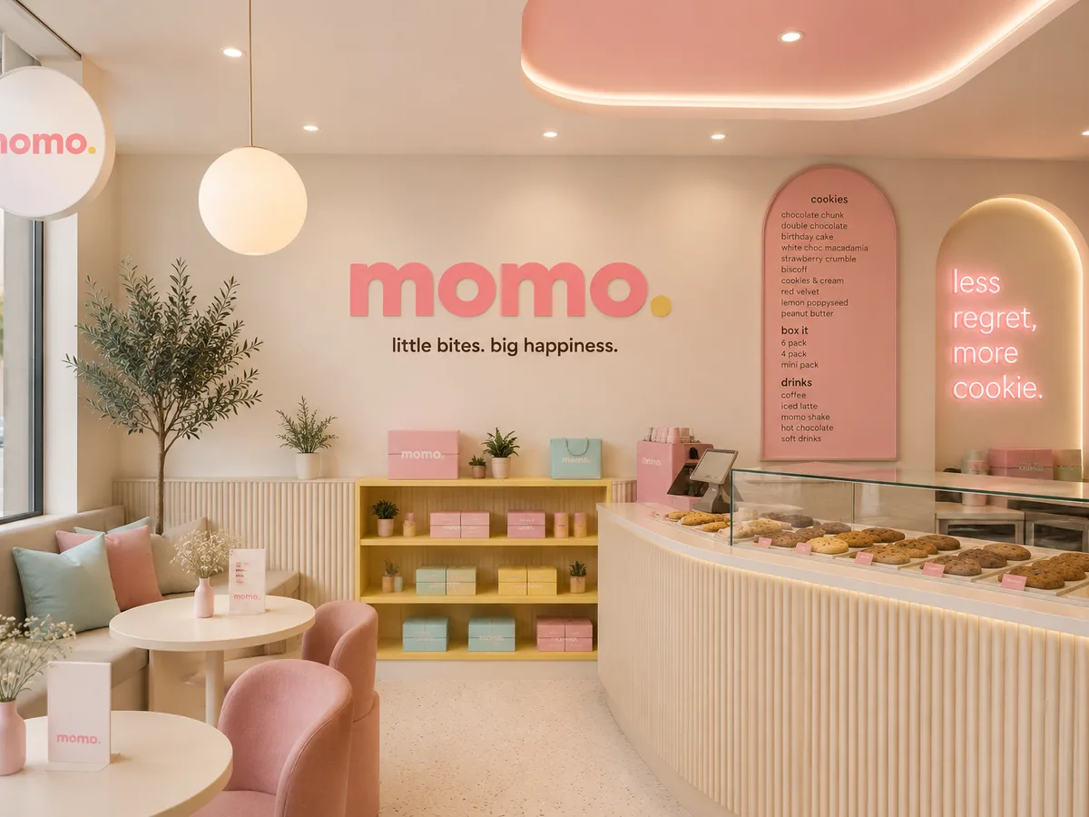
The whole site re-colours to pink, blue or yellow from a switch in the corner, remembered on the device. It runs on custom properties so the themes are three short blocks, not three stylesheets.
- 04
Lowercase everywhere
The brand sets every line in lowercase, including the navigation and the headings, which is what makes a site about cookies feel friendly rather than childish. The one exception is the price, because a number in a different register is easier to find.
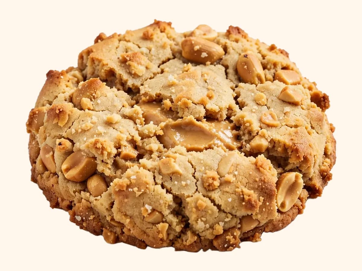
The imagery the brand was built on.
Every frame here was produced for this project, and the colour on this page comes out of these, not the other way round.
Where it landed.
Orders now arrive with the box already filled, the delivery address already checked and the cut-off already applied, so the kitchen bakes what was ordered by two o'clock and nothing else.
The identity scales to the twenty-fourth flavour without a designer: a new wrapper is a new colour and a new name, and every other element is already in place.
- Flavours, each on its own wrapper
- 23
- Colour themes, one keystroke apart
- 03
- Days to anywhere in the country
- 1–3
What it taught usTwenty-three products need one rule more than they need one colour.
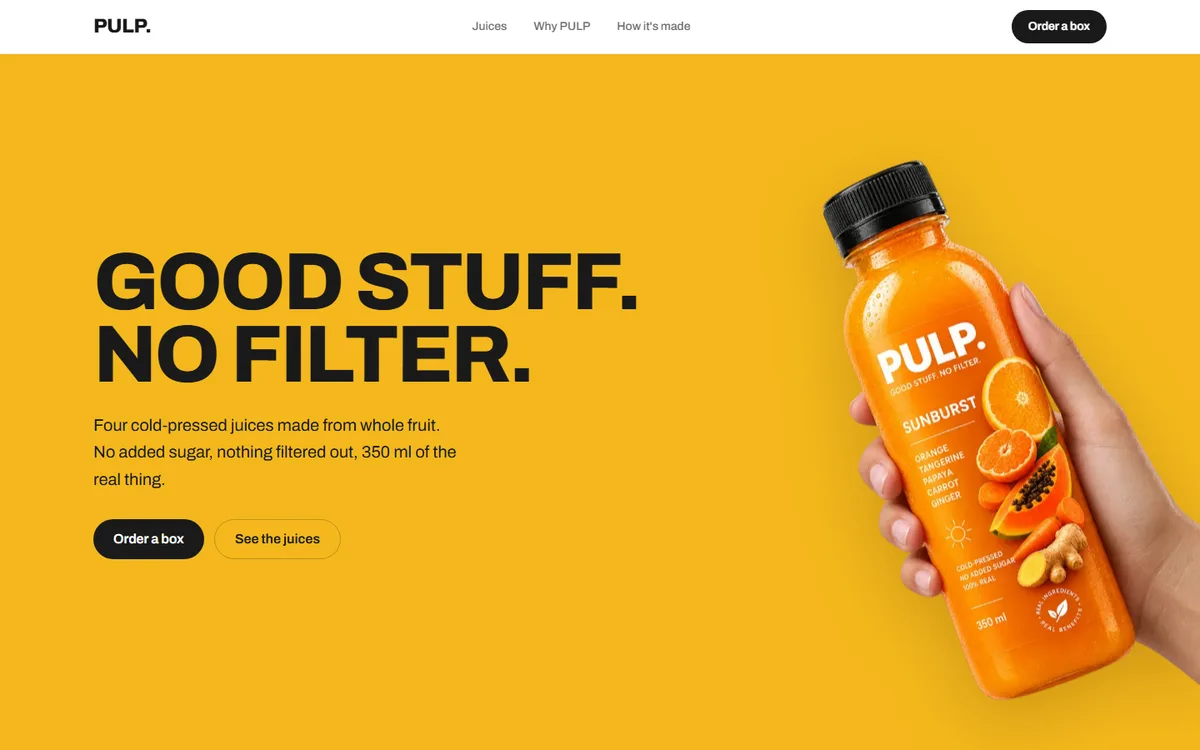
PULP
A juice brand with four flavours and no house colour. Each one takes the page over completely.
Food & drink2026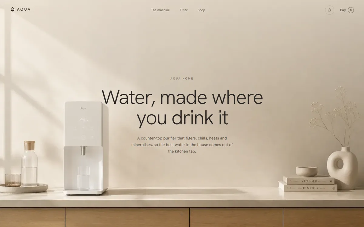
AQUA
A water product that refuses to look clinical: linen, sand and clay instead of the category's blue and chrome.
Home & appliance2026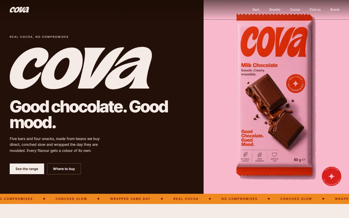
COVA
Four core browns plus a deep and soft pair per flavour, every hex sampled from the artwork rather than chosen beside it.
Food & drink2026
Start a project like this one.
Tell us what the business does and who it sells to. A fixed quote comes back inside two days.
- Office
- Sunninghill, Sandton, 2196
- Hours
- Mon–Fri, 07:00–17:00
- info@bonangtech.com