Glowvera
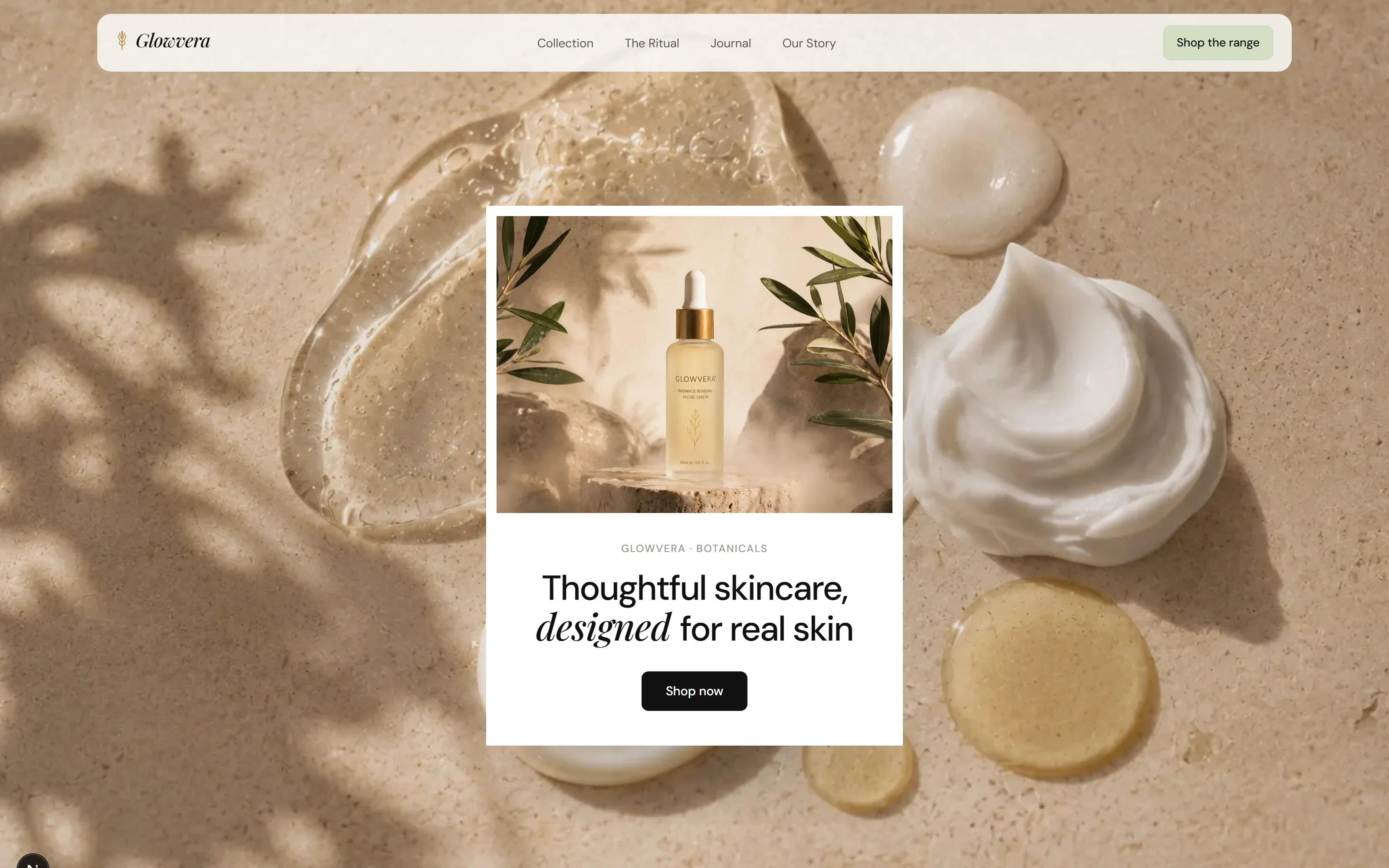
Skincare is the most crowded shelf in retail, and every brand on it has decided to look expensive in the same way. Glowvera goes quiet instead: a white page, one green, and product photography with room around it.
- Category
- Beauty & wellness
- Year
- 2026
- Scope
- 3 workstreams
- Brand identity
- Product photography direction
- Website
- Next.js
- TypeScript
- Tailwind CSS
- Vercel
The brief asked for luxury, which is a word that usually produces gold foil and a Didone. We argued for the opposite reading: on a white page, the most expensive-looking thing is space.
So the whole system is one accent (a sage taken from the botanical the range is built on) and a great deal of nothing.
Four decisions the whole project rests on.
- 01
One accent, used four times
Sage appears on the mark, the button, the rule and the ghost wordmark. Anywhere else it would stop meaning anything.
- 02
A serif with one job
Playfair sets product names and nothing else. Every other word on the site is DM Sans, which is what keeps the serif expensive.
- 03
The ghost wordmark
The name is set across the foot of the page at the width of the window, at a tenth strength, the closing signature of a printed brochure.
- 04
Photography with air
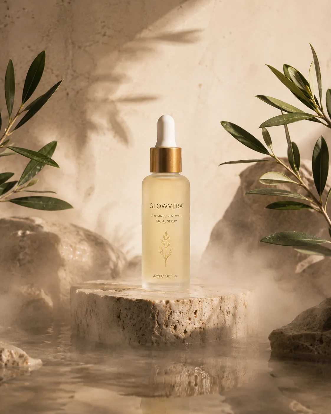
Every product frame is shot with room around the bottle, so the layout can crop it later rather than the reverse.
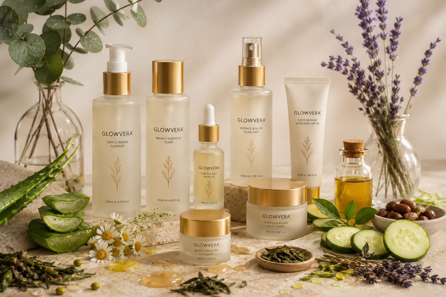
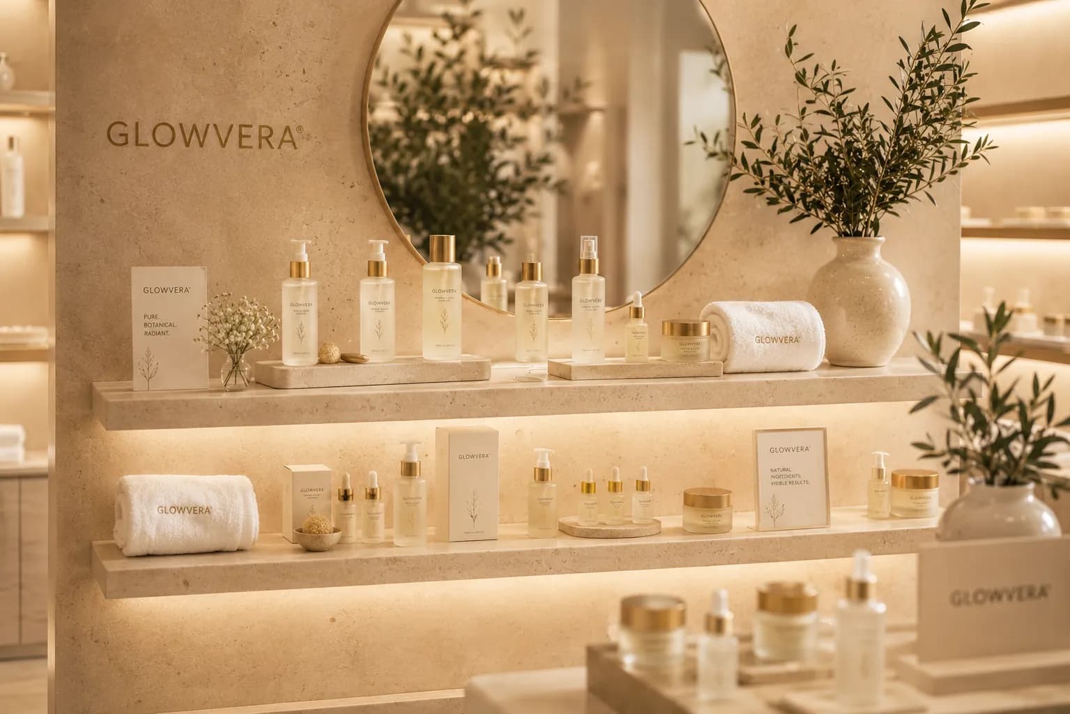
The imagery the brand was built on.
Every frame here was produced for this project, and the colour on this page comes out of these, not the other way round.

Where it landed.
A skincare brand that reads as considered rather than as expensive, which is the more durable of the two.
One accent colour doing four jobs, which is a system a client can actually follow without us.
- Accent colours in the system
- 01
- Places that accent is allowed
- 04
- Typefaces
- 02
What it taught usOn a white page, space is the luxury signal. Foil is not.
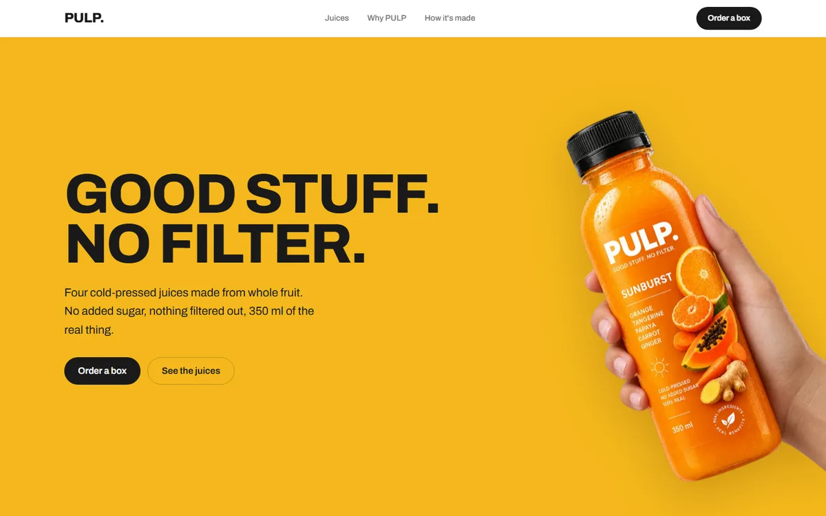
PULP
A juice brand with four flavours and no house colour. Each one takes the page over completely.
Food & drink2026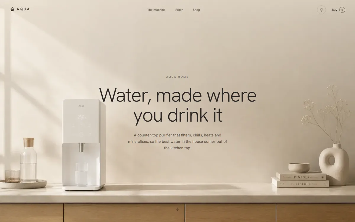
AQUA
A water product that refuses to look clinical: linen, sand and clay instead of the category's blue and chrome.
Home & appliance2026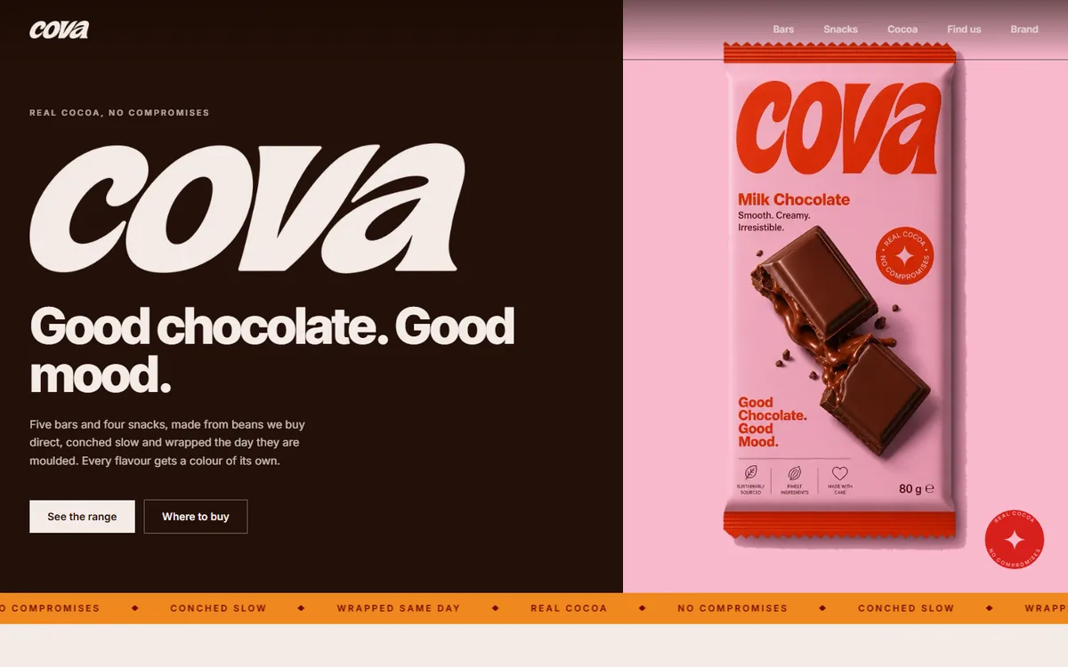
COVA
Four core browns plus a deep and soft pair per flavour, every hex sampled from the artwork rather than chosen beside it.
Food & drink2026
Start a project like this one.
Tell us what the business does and who it sells to. A fixed quote comes back inside two days.
- Office
- Sunninghill, Sandton, 2196
- Hours
- Mon–Fri, 07:00–17:00
- info@bonangtech.com