Three colours, one face, one letter.
The whole identity, written down and downloadable, so that anybody putting our name on something has the right files and the rules that come with them. It is built from the same tokens the site itself renders from, which means this page cannot go out of date while the site stays up.
- Logo files
- 09
- Colours
- 10
- Typefaces
- 02
- Permission
- info@bonangtech.com
A small kit, used strictly.
There is not much here on purpose. A system with three colours and one typeface is one that a junior designer, a print shop and a developer in a hurry can all get right without asking anybody.
- 01
Matcha is a destination
It marks the one thing on a screen you are meant to press, and the single band that closes a page. The moment it becomes decoration it stops pointing at anything.
- 02
Contrast comes from size
One typeface sets a 96px headline and a 15px paragraph. Where a second voice is genuinely needed, it is the 10px mono label, and it is never a sentence.
- 03
The star is the only ornament
The counter inside the mark is the bullet, the button icon and the divider. Nothing in this system is drawn twice, and nothing is drawn that the mark does not already contain.
One letter, drawn once.
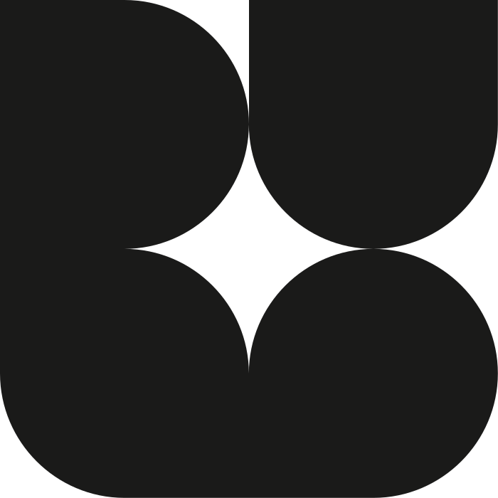
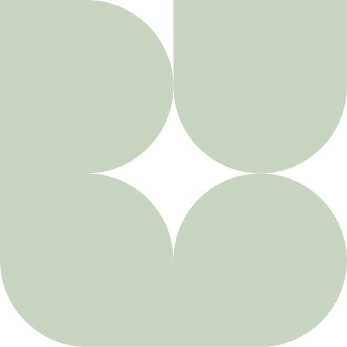
The mark is the letter u set in MTRY: a rounded square with a four-point star knocked out of it. It ships as path geometry rather than as live type, so it is crisp at 20px and at 20cm, no font has to load before it paints, and the licensed font file is never served to anybody.
The dashed line is the clear space: a quarter of the mark’s height on all four sides, which is the width of the star inside it. Nothing enters that margin. Not type, not a rule, not the edge of a photograph.
- Mark grid
- 700 × 700
- Tile grid
- 1008 × 1008, radius 284
- Clear space
- 25% of mark height
- Minimum, screen
- 20px
- Minimum, print
- 8mm
- Lockup minimum
- 120px wide
- The markWhere the name is already present.
- The tileAvatars, favicons, app icons.
- The sparkBullets, buttons, dividers.
Every file, in the version you need.
SVG for anything that will be resized, PNG for anything that will not. The PNGs are drawn in your browser from the same geometry this page is printing, at whatever size you press, on a transparent ground.
The letter u, drawn in MTRY and shipped as geometry. Use it wherever the name is already present or the surface is too small for the lockup.
Mark, Ink
The default. On paper, on Dust, on Matcha.
SVG is vector · PNG is transparentMark, Paper
On Ink, on Charcoal, over a darkened photograph.
SVG is vector · PNG is transparentMark, Matcha
On Ink only, and only where the mark is the single accent on the surface.
SVG is vector · PNG is transparent

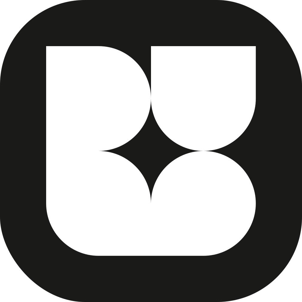
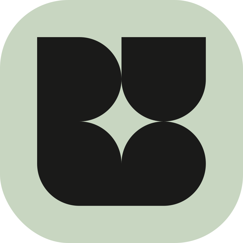
The mark in a rounded square, with the letter knocked out. This is the avatar, the favicon and the app icon. It is the only version that may sit on a busy background.
Tile, Ink
Ink tile, Paper letter. The favicon and the app icon ship in this.
SVG is vector · PNG is transparentTile, Matcha
Matcha tile, Ink letter. For a dark surface where the tile is the accent.
SVG is vector · PNG is transparent
The four-point counter from the middle of the mark, on its own. It is the whole ornament of this identity: a bullet, a button trailing icon, a divider. It is not a logo and never stands in for one.
Spark, Ink
List bullets, button icons, dividers.
SVG is vector · PNG is transparentSpark, Matcha
On Ink, where a single point of accent is wanted.
SVG is vector · PNG is transparent
Mark and name, locked together. The name is set in Inter Tight Semibold, sentence case, tracking -0.035em, with "Technologies" at Fade. It is never re-typed in caps and never letter-spaced out.
- Bonang Technologies
Lockup, Ink
The header, a letterhead, a signature block.
PNG is exact · SVG carries live type - Bonang Technologies
Lockup, Paper
The footer, a dark deck, a dark email header.
PNG is exact · SVG carries live type
The mark, the tile and the star are pure geometry, so they travel exactly: the SVG you download is the file this page is drawing from. The lockup carries live type set in Inter Tight Semibold, so its SVG needs that font installed to render as intended. Where that cannot be guaranteed, take the PNG, which is rasterised here with the real font already loaded.
Nine values, and only three of them are the brand.
Press any block to copy its hex, or the pill under it to copy the token. Where a colour moves in the dark theme, the second value is printed beside its name; Matcha never moves, because it is the one colour in the system that reads identically either way.
Ink, Paper and Matcha do all the work. If a screen needs a fourth colour to make sense, the screen is wrong.
Matcha
A destination, never decoration. It marks the one thing on a screen you are meant to press, and the single band that closes a page. It is the one colour in the system that reads identically in both themes, so it is never re-tuned for dark.
Ink
Dark #F4F4F1Every word on the page, the filled button, and the footer band. Not black: it is warmed off the axis so it sits with the paper instead of cutting a hole in it.
Paper
Dark #101110The ground. In dark it becomes the ink and the canvas deepens to #101110, which is the same page with the light switched off rather than a second design.
Two greys that are not colours so much as depth: the card ground, and the rule between cards.
Dust
Dark #1A1B19The surface a card, a panel or an alternating section sits on. Never used for type.
Line
Dark #2A2B28One hairline, everywhere: table rules, card borders, section divisions. There is no second border weight in this system.
The same ink at two strengths, for the half of a sentence that stops insisting and for small copy.
Fade
Dark #676861The second half of a display line, and the word "Technologies" in the lockup. It is how a statement on this site gives up its second clause.
Slate
Dark #9A9A92Body copy under a heading, meta rows, and anything set at 13 to 14px that is not the point of the paragraph.
Three colours that only appear at the size of a dot or behind a photograph. None of them is a brand colour and none of them ever fills a button.
Charcoal
The shadow laid over the hero photograph so paper-white type survives on it.
Moss
The status dot when something is running. Six pixels wide, and that is the whole of its job.
Clay
The section-tag dot, and the one warm note in a page otherwise made of greens and greys.
One face carries the site.
Inter Tight sets the headline and the paragraph. Geist Mono sets every 10px label. MTRY draws one letter and is never asked to do anything else.
Inter Tight
Display and bodyOne face carries the whole site. The headline runs at 96px with the tracking pulled to -0.045em, and the same family sets body copy at 15px. The contrast in this identity comes from size, not from a second family.
- Utility
- font-display / font-sans
- Source
- Google Fonts
- Licence
- SIL Open Font License 1.1
Technology that earns its place
Semibold, tracking -0.045emGeist Mono
Micro-labelsEvery label on the site is the same object: 10px, uppercase, tracking +0.14em. Section tags, card labels, buttons, meta rows and the footer small print. It is never used for a sentence.
- Utility
- font-mono
- Source
- Google Fonts
- Licence
- SIL Open Font License 1.1
Selected work · 2026
10px, uppercase, tracking +0.14emMTRY
The mark onlyMTRY draws exactly one character in this identity: the letter u inside the mark. It is shipped as extracted path geometry, so the mark is crisp at 20px and at 20cm, no font has to load before the header paints, and the licensed file is never served to a browser. It is never used for a word, a heading or a sentence.
- Utility
- shipped as vector, not as a font
- Source
- Marvadesign
- Licence
- Commercial licence, held by us and not redistributed
u
One glyph, drawn as a path
| Step | Size | Tracking | Weight | Where it is used |
|---|---|---|---|---|
| Hero | clamp(2.25rem, 5.4vw, 4.5rem) | -0.045em | 600 | The one display line at the top of a page. Never more than one per page. |
| Section heading | clamp(1.75rem, 3.4vw, 3rem) | -0.04em | 600 | Opens every section, in the six columns beside the tag. |
| Statement | clamp(1.05rem, 1.7vw, 1.4rem) | -0.02em | 500 | The lead under a hero, set in two inks: the first clause at full strength, the second at Fade. |
| Card title | clamp(1.05rem, 1.8vw, 1.4rem) | -0.03em | 600 | The heading inside a card or a list row. |
| Body | 15px / 1.6 | 0 | 400 | Paragraphs. Held to a 46 to 58 character measure. |
| Small | 13 to 14px / 1.55 | 0 | 400 | Supporting copy under a card title, in Slate. |
| Label | 10px / 1.6 | +0.14em | 400 | Mono, uppercase. Tags, buttons, meta, prices, small print. |
Five shapes, and never a sixth.
Everything on this site is assembled out of these. They are printed here live rather than as pictures, so what you are looking at is the component itself.
- Selected workThe tagOpens every section: a dot in Clay, Moss or Matcha, then the name in mono caps.
- Johannesburg · 2026The label10px, uppercase, +0.14em. Card labels, meta rows, prices, small print.
- The arrow badgeThe corner of a card that is itself a link. It fills with Ink on hover.
- A list itemThe spark bulletIn front of a list item, inside a button, on a dark panel. Never as a logo.
- The ruleOne hairline in Line, at one weight. There is no second border in this system.
Four things to do, four not to.
None of this is precious. It is the shortest list that keeps the mark recognisable on somebody else's surface, which is the only thing a logo has to do.
Give it room
Clear space around the mark is the width of the spark inside it, a quarter of the mark, on all four sides. Nothing enters that margin: no type, no rule, no photograph edge.
Pick the version for the ground
Ink on anything light, Paper on anything dark. If neither survives, put the tile down first and set the mark inside it.
Keep the lockup locked
Mark and name are one object at one ratio. Scale the whole thing or use the mark alone. Never rebuild the pair by hand.
Respect the floor
The mark stops at 20px on screen and 8mm in print. The lockup stops at 120px wide. Below that, use the mark alone.
Do not recolour it
The mark is Ink, Paper or Matcha. Not your brand colour, not a gradient, not a photograph filled into the letterform.
Do not decorate it
No shadow, no glow, no outline, no bevel, no rotation, no stretch. The letterform is one flat shape and it stays one flat shape.
Do not re-set the name
Not in caps, not letter-spaced, not in another face, not with the word Technologies at full strength. The lockup file exists so this never has to be typed.
Do not use MTRY for words
The licensed face draws one glyph in this identity. The moment it sets a heading it stops being a logo and starts being a typeface, and this system already has one.
Our mark, next to yours.
If you are a client, a partner or a supplier putting the Bonang mark on your own surface, these four rules are the whole of it, and the files above are the only artwork to use.
Equal height, not equal width
Match our mark to the cap height of yours, not to its bounding box. Two marks of different widths at the same cap height look like a pair; two of the same width rarely do.
Divide with a rule
A single hairline in Line, at the height of both marks, with the clear space of the larger one either side of it. No plus signs, no ampersands, no slashes.
One accent between you
If your identity has an accent colour, ours goes to Ink or Paper for that surface. Two accents on one lockup and neither one lands.
Ask before you print
Send the artwork to info@bonangtech.com before it goes to press or into a campaign. We answer inside two business days and we have never yet said no to something drawn properly.
What we build, host and support on. They are set as names rather than as logos on purpose: two dozen third-party marks in a row is somebody else’s brand guide, not ours, and every one of them would need permission.
What each one is for- Build
- Next.js, React, TypeScript, Tailwind CSS, Node.js, React Native
- Data
- Supabase, PostgreSQL, Prisma
- Cloud
- Vercel, AWS, Microsoft Azure, Cloudflare, Docker
- Workplace
- Microsoft 365, Google Workspace, Entra ID
- Design
- Figma, Adobe CC
- Operate
- VS Code, GitHub, Resend, Stripe, Sentry
How the words are set.
The identity is not only the mark. Most of what a reader meets on this site is a sentence, and the sentences follow rules too.
- 01
Say the thing
A sentence carries one claim and stops. If a paragraph can lose its second half and still mean what it meant, it loses it.
- 02
Sentence case, always
Headings, buttons, navigation. The only capitals on this site are the 10px mono labels, and they are a texture rather than an emphasis.
- 03
Numbers, not adjectives
99.9% uptime, two business days, twelve brands. We do not write world-class, cutting-edge, or bespoke.
- 04
Ordinary punctuation
Commas, colons and full stops. No em dashes, no exclamation marks, no ellipses trailing off a promise.
The name Bonang Technologies, the mark and the star are ours. You may use the files on this page to refer to us: to say you work with us, to credit us, to put us on a partner page or in a deck. You may not use them as your own mark, as part of one, in a domain name, or in a way that suggests we endorse something we have not seen. MTRY is licensed to us by Marvadesign and is not ours to pass on, which is why the mark is shipped here as artwork and never as a font file. If you are unsure, send us the artwork at info@bonangtech.com and you will have an answer inside two business days.
Need something the kit does not cover?
A print size, a co-branded lockup, an animated version, or the mark on a surface nobody planned for. Send it through and we will draw it properly.
- Office
- Sunninghill, Sandton, 2196
- Hours
- Mon–Fri, 07:00–17:00
- info@bonangtech.com